[Case 02]
66% More Efficient Navigation in Content Heavy Pages
Health | B2C

66% More Efficient Funding Lookup Through Revamped Navigation
Improving Navigation Experience for An NGO' Information Hub
Project Overview
This is an iConsultancy capstone project being completed by five University of Maryland students on behalf of American Occupational Therapy Foundation (AOTF). This project gives us the opportunity to apply the skills learned through coursework to a real world problem. This project follows the research, design, and evaluation process from end-to-end.
Team
3 UX Designer (include me)
1 UX Researcher
1 Developer
1 Director of Communications and Marketing
[Industry]
Health NGO
[My Role]
Lead UX Designer
[Platforms]
Desktop
[Timeline]
Jan 2025 - May 2025
3.5 Months
View all Cases
Outcome
66% reduction of average time to find an active funding
68% boost in user navigation satisfaction
75% boost of success rate to locat application details in two minutes
Final Solution Showcase
Background
New pages and sections were added without a plan, causing usability issues
American Occupational Therapy Foudation
NGO
Health Industry
[Business Need]
Strengthen its role as a central hub for connecting people with research resource in occupational therapy
[Goal]
Better support students and researchers finding financial and research-related information
[Chanllenge]
Unclear navigation and visual hierarchy is confusing people
Content has piled up over time, making it increasingly difficult for users to find what they need. After receiving growing feedback and complaints about usability, AOTF turned to us for a design overhaul.
Research
Quantitative and qualitative data showed that users often get lost when searching for funding.
Site Analytics
Scholarship and Grant pages received the highest engagement—accounting for 21% of 233k views and attracting 39% of 74k active users over the past year (based on Google Analytics)
User Testing
Searching for funding was a common task. However, many clicked “Scholarship,” missing options hidden under “Grants.”

Problems
Users went down the wrong paths due to confusing navigation, scattered information, and hard-to-read formatting
Unclear Navigation
People often took the wrong path and had to backtrack, making them frustrated and more likely to give up..
The layout and structure of information is not intuitive.
A Graduate Student
Better support students and researchers finding financial and research-related information
An Associate Professor
Unstructured Information
Too much text without clear layout made it hard for users to find and understand key information.
his looks too busy. I feel like keeping scrolling.
An Occupational Therapy Clinician
It is too lengthy but with important info.
A Graduate Student
Inconsistent Formatting
Inconsistent styles for buttons and links caused misclicks and made the site feel less trustworthy.
I see different blues on the site making it not consistent
A Graduate Student
I expect it to be clickable while it's not.
An Associate Professor
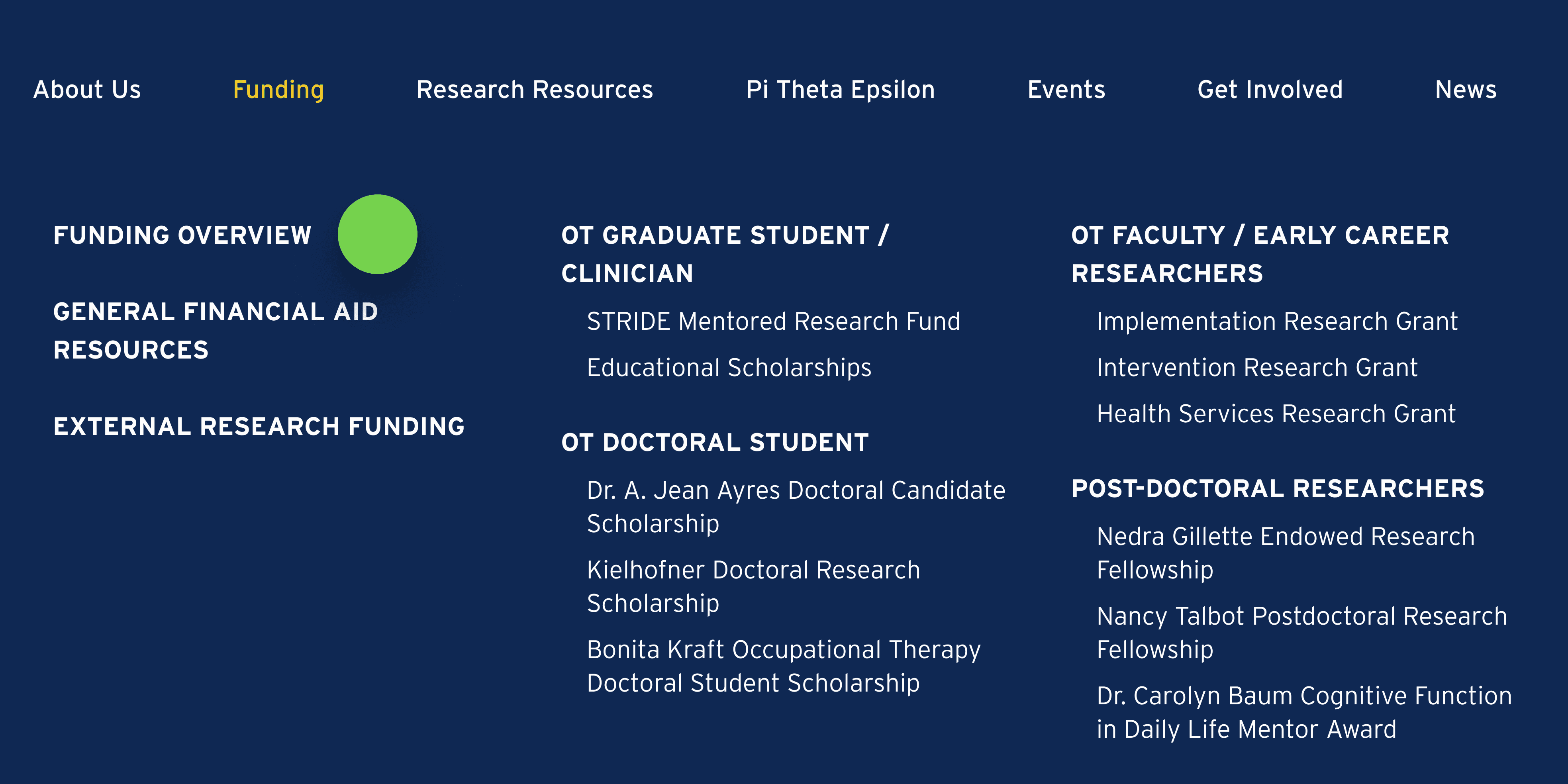
Solution - #1 Information Architecture
Firstly, I rebuilt the info hierarchy by creating new IA and menu so users can find the right direction from the start
[Problem It Solved]
Unclear Navigation
Unstructured Information
[Why It Matters]
Faster Navigation
Less Frustration
BEFORE
Two tabs split funding info and confused users, making it hard to find the right opportunities.
No further categorization and visual hierarchy to lead next step.
AFTER
One clear “Funding” tab as the centralized entrance
Group funding by career Level so users can find the target in a quick scan
Solution - #2 Content Redesign
Then, I created a overview page for scattered information to give users the big picture
[Problem It Solved]
Unclear Navigation
Unstructured Information
[Why It Matters]
Reduce users' cognitive load
Increase user control and task efficiency
BEFORE
Text-heavy list of funding without clear grouping
Lack of headings, whitespace, or visual anchors makes it hard to scan quickly.

AFTER
Clear intro and visual grouping by career level
Consistent formatting and scannable layout
Key links and CTA surfaced up front

Solution - #3 Visual Consistency
I also improved visual consistency throughout the site to make content easier to scan
[Problem It Solved]
Unstructured Information
Inconsistent Formatting
[Why It Matters]
Consistent visuals help users scan content quickly, understand structure more easily improving site’s credibility.
BEFORE
Two tabs split funding info and confused users, making it hard to find the right opportunities.
No further categorization and visual hierarchy to lead next step.
AFTER
One clear “Funding” tab as the centralized entrance
Group funding by career Level so users can find the target in a quick scan
User Testing
Navigation efficiency has been improved significantly, but one important feature is missed by most users
Yes…
All participants gave positive feedback on improved navigation experience
Task completion time was reduced by 41%
But…
80% participants didn't notice the centralized funding table on the funding overview page
When it was pointed out, every one of them agreed it would have been helpful if they had seen it earlier.
Why it matters
The low discoverability of alternative paths impact user control
The overlooked pathway leads to a centralized funding table, which could further reduce cognitive load and improve efficiency
In follow up interviews, user feedback confirmed its value. It just needs to be more visible
Design Iteration
To improve the discoverability of alternative path, I adjusted the menu hierarchy and page layout
Actions
Re-evaluated the visibility and placement
Assess how and where the overlooked pathway appears in the flow to ensure it catches users’ attention earlier
Refined visual cues and layout
Adjust its position in the menu bar and in-page layout to guide users toward it naturally.
BEFORE

AFTER

Design Handoff
To support development and CMS editing, a comprehensive design handoff doc is delivered.
[What it includes]
Icon Collection
Design System
Page Template
Final Prototype
[Why It Matters]
Reduces ambiguity for developers
Maintain visual and functional consistency across pages and future updates
Empowers AOTF to confidently manage and update content without breaking the design.

Learning
Design process needs to stay flexible
As we dug deeper into the project, we realized the challenges were more complex than expected. It wasn’t just a visual issue—it was a deeper problem with how the site communicated and functioned. This shift led us to rethink our design approach. Rather than following a rigid framework like the Double Diamond, we stayed flexible and adjusted our process as new challenges emerged.
Research quickly became a much larger part of the project than originally planned. To reach the depth we needed, we conducted user interviews, usability testing, card sorting, and a brand identity workshop to understand the intent behind the content and how it supported the organization’s broader goals. To stay on schedule, not every activity happened in sequence. We ran some research and design phases ran in parallel.
This experience taught me that
Every design challenge is different, the design process needs to stay flexible and adapt to the situation.
Design frameworks represent a mindset that a UX designer should have, but in practice, the workflow should be shaped by business goals, user needs, and technical constraints.
Testimonial
