[Case 01]
20% Higher Repair Efficiency by Redesigning the Technical Database
Electronic | B2B
In order for NiceBuy to provide high-quality repair service, it must provide its technicians with the most reliable tools.
Every day, thousands of NiceBuy technicians rely on an internal technical database to identify parts and lookup tech sheets. This is an opportunity to turn a complex data repository into a streamlined, high-performance tool.
Business Need
Leadership decides to modernize the internal tool to reduce unproductive time and lower the operational costs.
Goal
Empower technicians with an upgraded digital experience to finish repair tasks more efficiently.
Challenge
How can we redesign a technical database to match a technician’s physical workflow and eliminate the "digital dead-ends" that stall repairs?
Industry
Electronic Retailer-Repair Service
Platform
Desktop
Timeline
Aug 2025 - Nov 2025 (4 Months)
Team
2 UX Designers (include me)
1 UX Researcher
5 Developers
1 PM
Outcome
+31%
Search Success
Higher model lookup accuracy
-28%
Task Downtime
Saved per part identification
+20%
Repair Efficiency
Faster customer repair service
Research
I discovered that the existing database was disorganized and rigid, forcing technicians to abandon the tool in favor of "shadow workflows" (inefficient, manual workarounds like calls and emails).
Collaborating with the NiceBuy operations team, I developed a research plan to identify the friction points in the repair journey. I conducted interviews with both junior and senior technicians to understand how the platform’s limitations directly impacted their daily output.
Research Goals
How do technicians use the digital database during a repair?
Which interface elements of the current tool are slowing down the repair?
What does a truly supportive database platform look like to a repair technician?
Key Takeways
Technicians are on the clock
They don't have time to hunt through pages of documentation. They need answers immediately.
Technicians think in 3D, not text
Their expertise is hands-on. Forcing them to decode paragraphs into physical parts makes them frustrated.
Technicians want to be focused
Stepping away from a repair to chase down missing information or contact support breaks their concentration.
Problem to Solve
NiceBuy technicians struggle to use the database during high-pressure repairs due to lack of visual guidance and no fallback for missing data, which forces them into slow manual workarounds and erodes trust in the system.
Strategy
I understood that my solution needed to be intuitive and contextual so technicians could find needed data with a low cognitive load and stay focused on repairing.
Guiding Principles
From user insights I understood these principles must be true in order for my solution to be successful.
PRIORITIZE SPEED
Technicians are always working against downtime costs
VISUAL OVER TEXT
Technicians work with their hands and eyes.
RESPECT EXPERTISE
The tool is to support the technician's professional judgment.
PROTECT THE FLOW
Keep technicians in the repair, not chasing information.
DON'T ADD STEPS
Every extra click is time away from the repair
ADAPT TO THE SITUATION
Different repair require different levels of details.
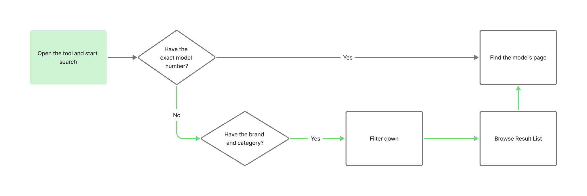
Solution - #1 Findability
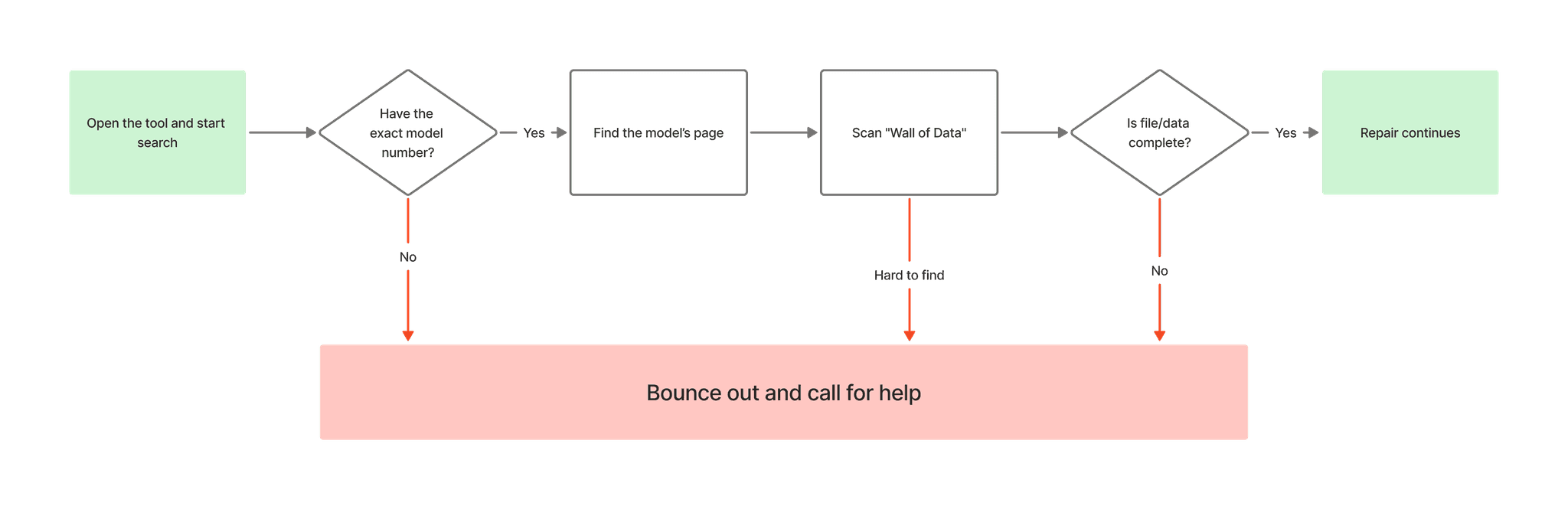
Firstly, I rebuilt the search feature to reduce friction and faster decision-making.
Problem This Solved
Rigid exact-matching blocked users.
Lack of filters result in limited usability
Why It Matters
Handles any scenario
Allows search results verification
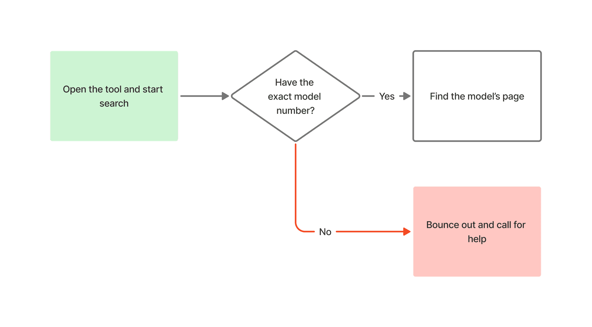
Before
Limited search with a single search bar
No filter options, no flexibility
Easy to abandon the workflow
AFTER
Faceted filters and result metadata available
Increase overall system usage during daily operations
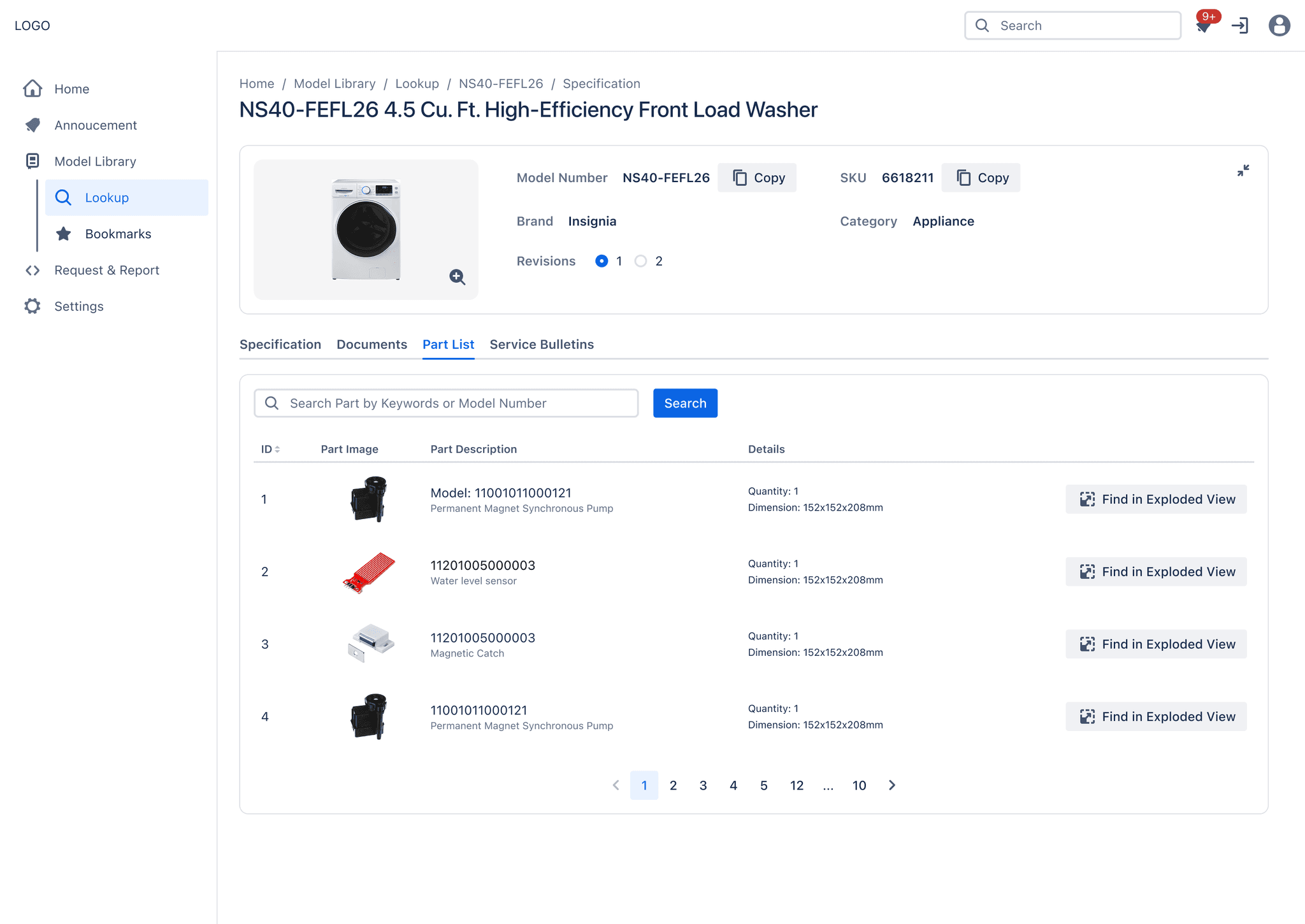
Solution - #2 Information Hierarchy
Then, I used interactive diagrams and structured data bring order and clarity to technical details.
Problem This Solved
"Wall of text" mixed everything indiscriminately
Critical data were buried and hard to spot
Low and painful cross-referencing
Why It Matters
Drastically reduces scanning time
Prevents costly errors from ordering the wrong part
Speed up the technician's workflow
BEFORE
Zero Visual Context
Technicians had to identify physical parts based solely on text descriptions, which is a high-risk guessing game.
Flat Hierarchy
Critical documents (PDFs) and hundreds of spare parts were stacked in a single scrolling page, forcing users to hunt for information.
Manual Cross-Referencing
To verify a part, a user had to open a separate PDF tab, find the diagram, memorize the number, and switch back to this list to search for it.
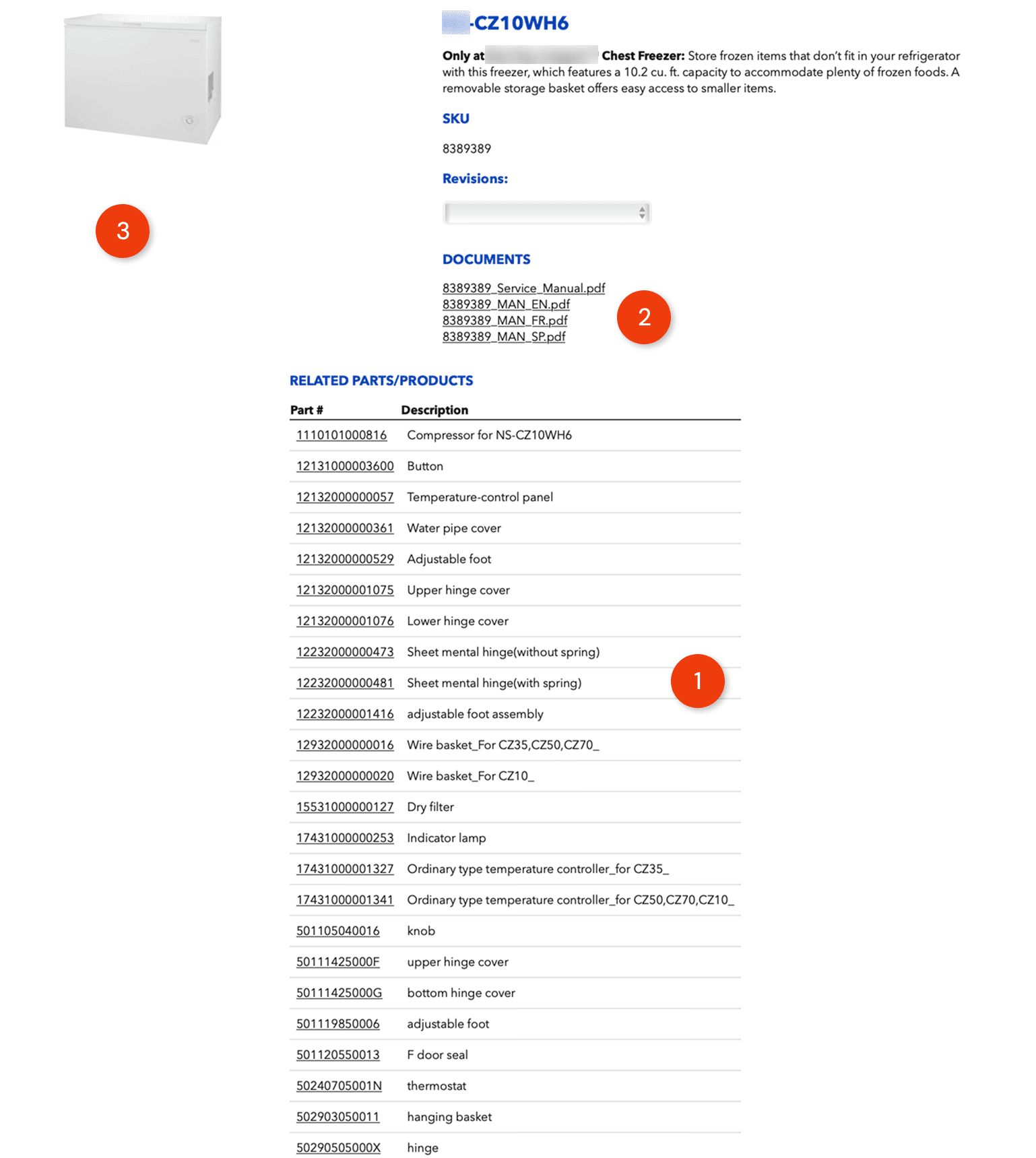
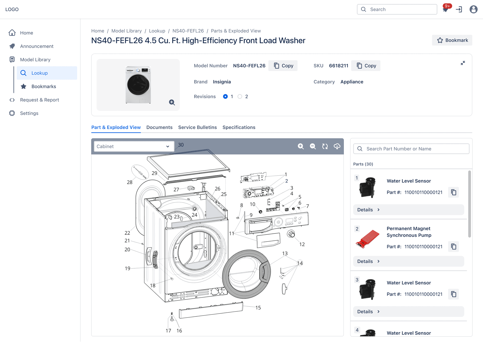
AFTER
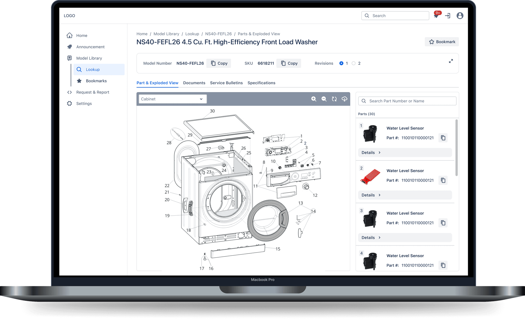
Tabbed Hierarchy
Information is sorted into clear tabs, showing users only what they need for the task at hand.
Interactive Part Exploded View
The part exploded view bridges the gap. Clicking a part on the diagram instantly highlights the correct row in the list, confirming the exact part.
Instant Visual Verification
Technicians can visually identify components, select parts directly from the diagram, and immediately access detailed part information without manual cross-referencing.
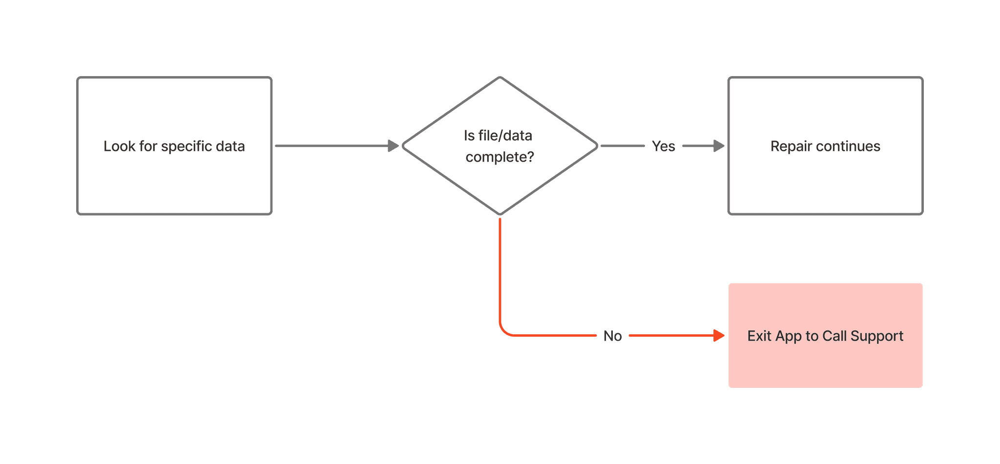
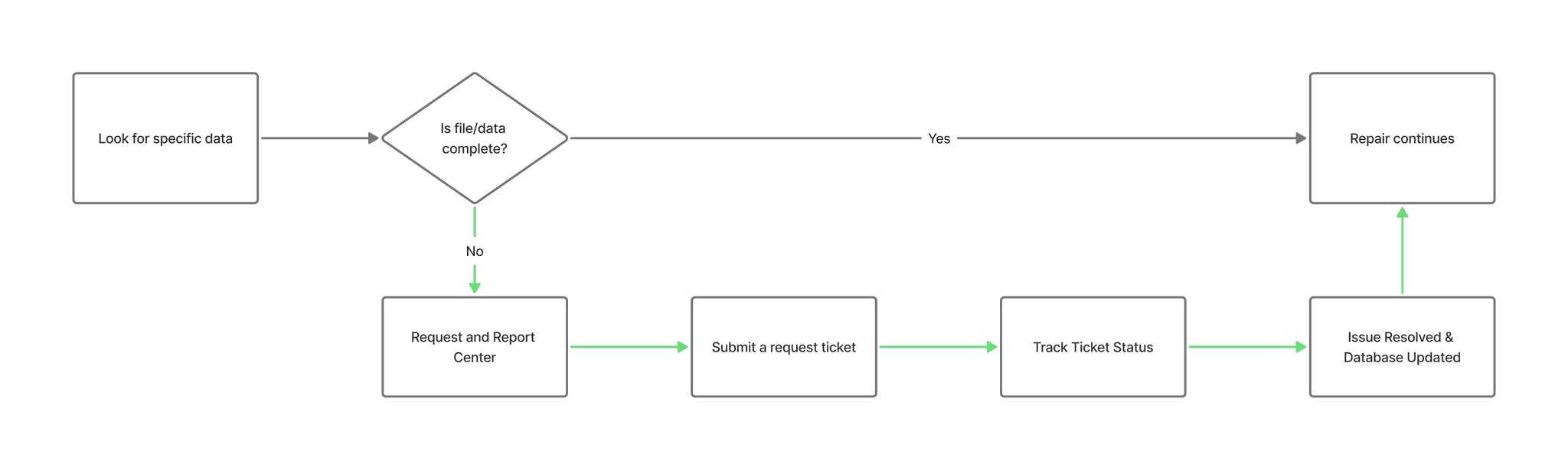
Solution - #3 Feedback Loop
A transparent in-system feedback loop bridges information gaps and builds trust.
Problem This Solved
The lack of a feedback mechanism created a "dead end"
Users were forced to abandon the app for external calls and emails
Why It Matters
In-system reporting reduces reliance on support calls.
High traceability & transparency
Turns frustration into a positive improvement loop.
BEFORE
Broken Workflow
When data was missing, the system provided no way to report it. Users were forced to abandon the app and rely on "shadow workflows" like personal emails or phone calls.
The "Black Box" Frustration
Technicians had no idea if their feedback was received or acted upon, leading to a feeling of being ignored.
Untracked Gaps
Errors reported via phone calls were often lost or not well recorded in the database, meaning the next technician would encounter the exact same problem. This also caused repetitive maintenance issues.
AFTER
Integrated Feedback Mechanism
Replaced external emails and calls with a centralized reporting tool. This allows technicians to flag missing information directly within the platform, keeping the workflow contained and trackable.
Visual Traceability
The Request Center provides real-time status updates (e.g., "In Progress," "Resolved"). This transparency eliminates the "black box" feeling and proves to the technician that their input is driving actual change.
Systemic Improvement
By centralizing these reports, the system turns individual frustrations into permanent database fixes. A single report now prevents future technicians from encountering the same missing data.
User Testing
Clarity has been improved, but the workflow demanded more efficiency.
Yes…
All participants believed that new data table design succeeded in providing Clarity
Clean and easy to scan
But…
Unless having the specific part number, technicians often bypassed the table to click the "Find in Exploded View" button immediately
Cognitive speed bump occurred
Design Iteration
To eliminate the friction of cross-referencing, I inverted the hierarchy to prioritize the Parts Exploded View
Hero Visualization
The diagram is expanded to occupy the majority of the screen, establishing it as the visual anchor for navigation.
Hierarchy Inverted
A list-first layout is shifted to a split-screen layout, promoting the Exploded View to the primary while demoting the list to a supporting sidebar.
Dynamic Sidebar
The parts list is relocated to a responsive side panel and allows the list to update in real-time as the user explores the diagram.
Point-and-Verify
Synchronized interaction is implemented: clicking a component on the drawing instantly highlights the specific data row, enabling immediate confirmation.
Learning
Structure should follow the workflow
As I spent more time analyzing the technicians' workflow, I realized there was a disconnect. I was thinking in terms of "features" and "pages," but they were thinking in terms of the physical reality: tasks, parts, and failure scenarios.
It became clear that my job wasn't just to organize files; it was to map the system to their actual workday.
This shifted my focus on how information was presented. Even with standard categories like Documents or Specifications, the way we structured the content needed to be unambiguous and operational. It was about ensuring that when a user looked for a solution, the language and structure matched exactly how they talked about the problem on the floor.
This experience taught me that:
Speak their language: UX naming in B2B shouldn't be "marketing-ready." It needs to be raw, operational, and exactly what the user calls it—optimizing for speed over elegance.
Match the Mental Model: Users don't care about our database structure. The interface needs to reflect their goals (fixing a part) rather than our system architecture.